GNOME 42 is released in a few weeks. I figured I’d whet your appetite by serving up a tasty sneak peek at the new features and key changes the update is set to bring.
Quick NavigationShell ChangesNew Screenshot UINew’Appearance’ HubRDP Replaces VNCLots of libawaita PortsNautilus Gets a Boost2 Brand New AppsPerformance BoostOther changes
And boy is there plenty to talk about!
GNOME 40 set a new direction for the course of free software’s most widely used desktop environment, a direction that GNOME 42 very much follows.
With the horizontal desktop layout now in place developers turned their attention to upgrading other parts of the desktop stack. GNOME 42 features a plethora of GTK4/libawaita app ports, intros a retooled screenshot experience, and makes several notable performance upticks.
Keen to learn more? Read on!
GNOME 42: New Features
Refined GNOME Shell theme
 Improved Shell theme in GNOME 42
Visual changes punctuate the GNOME 42 release. Several areas of the desktop benefitting from theme reworks. Chief amongst them is the GNOME Shell desktop UI.
The theme tweaks on show probably shouldn’t be described as ‘major’ ones but they are certainly ‘mindful’.
The triangular “call outs” that previously anchored applet pop-overs to their origin are gone (as are GNOME Shell’s iconic rounded window corners). In their place comes …Well, nothing. Menus now sit closer to the top bar, making their point of origin an inference rather than a literal annotated one.
An aesthetic tightening affects almost every part of the Shell UI in GNOME 42. The margins around applet menus are reduced and the spacing between items inside decreased.
The on-screen display (OSD) bubbles for volume, brightness, etc also get revamped. Giant boxes with large icons give way to proportioned “pills” — the same amount of info is conveyed, but with a much smaller display footprint.
With GNOME Shell as a whole is faster and more focused in each iteration it feels logical that the UI on top of it is ‘toned‘ up too.
New Screenshot Experience
 Interactive screenshot UI
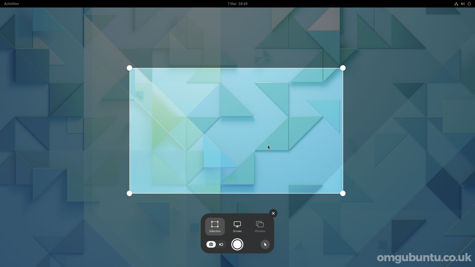
GNOME 42 makes screen grabs and screen recordings a breeze by adding a native, fully-interactive screenshot tool to GNOME Shell.
No longer a separate app, you just hit print screen to call up the new UI. From here you can screenshot your entire screen, an area you select using the on-screen marquee, or a specific open application window.
Flick the toggle in the control bar from camera to recorder and you can record your entire screen, a portion, or just an app window in the same manner. Yes: GNOME’s hitherto secret screen recording feature is a secret no more!
The moment you press print screen a full-screen screen grab is captured. This isn’t obvious as the on-screen UI appears ready for positioning, inferring that you still need to take the screenshot. Just ignore this; hit Enter after hitting Print Screen to save whatever was on your screen at that moment.
While you can show/hide the mouse pointer there is not (that I’ve found) a way to take a screenshot with a delay. This is something I do a lot (as I often need to demonstrate something within the UI that can only be seen during interaction).
But it’s still a great, modern improvement over the old screenshot tool (which will likely remain available to install, so if you prefer it, use it).
New ‘Appearance’ Hub
 Smooth transition between light and dark mode
GNOME 42 includes a couple of key Settings app changes, but the first I want to touch on is the new “Appearance” panel (which replaces the “Background” panel in earlier builds).
From here you can enable the standards-friendly ‘dark mode’ setting. While most GTK4/libadwaita apps respect the preference by default I should stress that its support in older GTK versions (not to mention other toolkits) may vary — so don’t get too irate it some of your apps don’t pick up on it.
You can also change the background wallpaper from the Appearance panel. Notably, all of GNOME’s stock backgrounds feature a dynamic light/dark variant. This will change depending on your dark mode preference.
To compliment these changes a smooth on-screen transition is applied when switching between light and dark mode, as demoed in the gif above.
New Remote Desktop Setup
 The new Remote Desktop dialog (image: @jadahl)
As part of porting Settings to GTK4/libadwaita a number of the control centre panels were redesigned, including the Display and Applications settings. Also redesigned is the ‘Remote Desktop’ dialog accessible from the Sharing section, as screen sharing in GNOME 42 makes use of RDP rather than VNC.
Libawaita Liftoff

Updated UI visuals + Faster performance + New modern widgets
GNOME 42 is the first version of GNOME to put libadwaita at its heart (though a few libadwaita apps did ship in GNOME 41, such as the ‘extension prefs’ tool). This updated toolkit brings a fresh new look, better performance, and new widgets that devs can use to make apps more adaptive and engaging.
A bunch of GNOME’s core apps have now been ported to GTK4/libadwaita, with GNOME 42, including:
Disk Usage AnalyzerFontsTo DoTourCalendarClocksSoftwareCharactersContactsWeather
More apps will be ported in due course, including…
Files

 Left: new folder icons; Right: new path bar
Technically speaking Files (aka Nautilus, the default file manager on the GNOME desktop) already has a libadwaita port. It was part of the GNOME 42 beta. However Fedora (which I’m testing the release on) ships with Nautilus v42 that uses GTK3 and the old Adwaita theme, instead of libadwaita.
I’m not sure which version of Nautilus GNOME 42 will ultimately come with, but whichever toolkit version it uses it still carries the following new features:
New path barNew path bar menuLarger ‘Rename’ popoverSupport for searching creation date
The new path bar is designed to show more of the directory path on screen, with scrolling overflow where needed. The rename pop-over is now wider to allow for easy entry of longer filenames. The ‘current location’ menu migrates to a new button at the end of the path bar, and the primary app menu now houses the undo/redo options.
Though not part of Nautilus itself, you will notice that GNOME’s default icon set now sports some snazzy newly recoloured folder icons.
Two New Apps
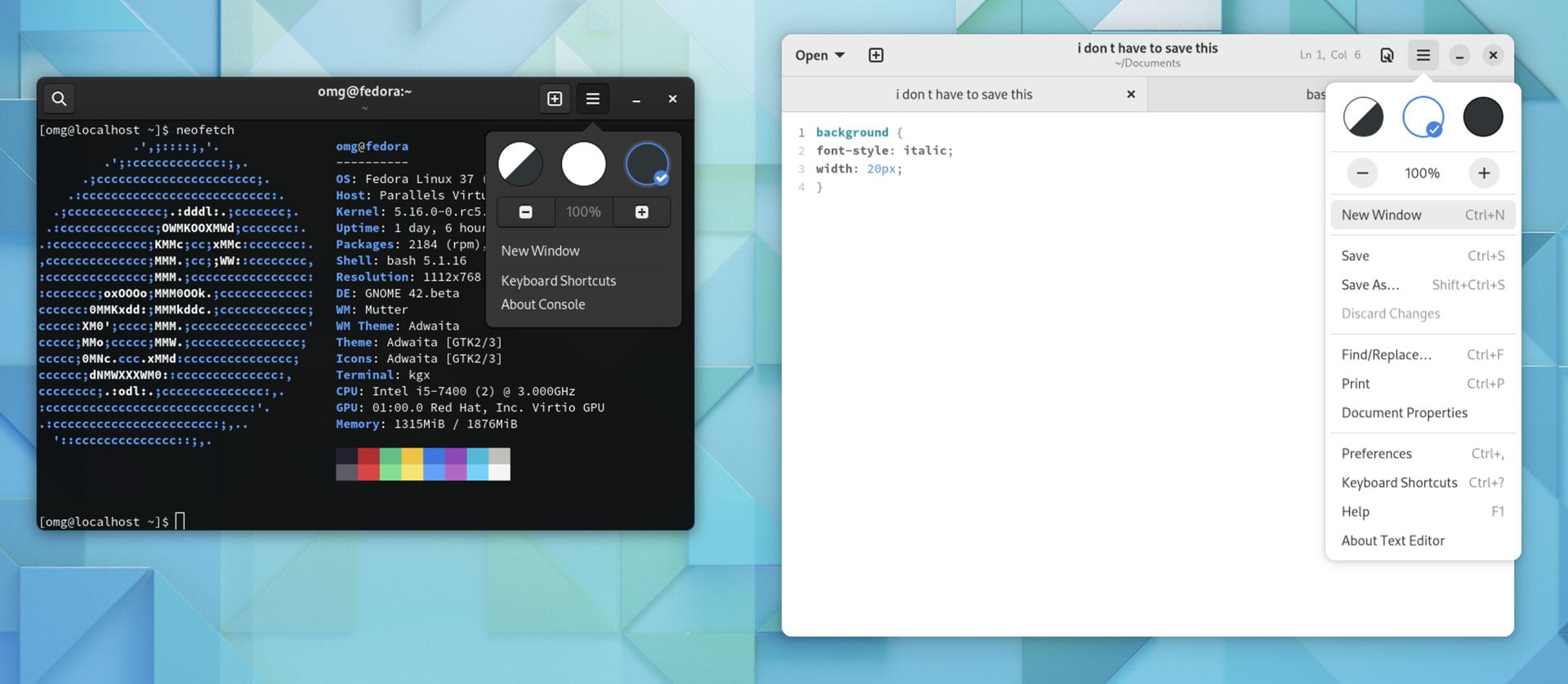
 Console and Text Editor
GNOME 42 ships two new core apps: Console (replacing GNOME Terminal) and Text Editor (replacing Gedit). Both apps are intended to be simpler, user-friendly replacements adhering to the latest GNOME HIG.
Of the two, Text Editor is the more interesting app. It boasts an engaging design, a robust set of preferences, and an autosave feature(very handy for klutz hands like me). Console is a little more no-frills but is, arguably, all the better for it, catering to those who use the terminal occasionally rather than religiously.
It’s important that I stress neither GNOME Terminal or Gedit are defunct or obsolete. They’re still available, still work, and, for a great many users, remain their go-to tools for the foreseeable future.
Performance Boost
GNOME 42 includes a number of performance-focused tweaks that aren’t easy for me to screenshot but do make an appreciable difference in how the desktop performs.
A number of specific tune-ups combine to deliver this, with GTK4’s GPU acceleration among them. But the most notable uplift comes from triple frame buffer support. This boosts GPU rendering performance (when required) to deliver a smoother desktop experience — by as much as 2x on Intel graphics and the Raspberry Pi.
Other changes
A quick overview of some other changes included in GNOME 42:
Hardware-accelerated rendering in Web (Epiphany)Overlay scrollbars in Eye of GNOMESmooth keyboard scrolling in Eye of GNOMEConsolidated image metadata in Eye of GNOMETracker indexer memory usage cut by 50%Maps now shows icons for u-turns in turn-by-turn routing‘Year’ view in Calendar is now a month navigator
Getting GNOME 42
GNOME 42 is due for release on March 23, 2022. The update will be pushed out to rolling release distros shortly thereafter but fixed-release distros (like Ubuntu) don’t typically offer new GNOME releases out of series (though third-party repos often do).
Ubuntu 22.04 LTS will ship with the bulk of GNOME 42 (including the new shell, performance enhancements, screenshot UI, etc) but hold back on shipping libadwaita ports of core apps (though several libadwaita ports will be available in the repo).
In the mean time you can try GNOME 42 using the GNOME OS .iso, though keep in mind that this image is meant to be used with GNOME Boxes and may not boot (or work as intended) under other virtualisation methods.

